"A brand is no longer what we tell the consumer it is—it is what consumers tell each other it is."
First Impressions = Fast Decisions
Google found people form opinions in 50 milliseconds. Half a blink. Your profile pic, logo, and grid layout are judged instantly.
Lucidpress reports: consistent branding can boost revenue by 23%. On IG, that translates into followers who recognize (and trust) you at a glance.
Logos That Stick (Not Suck)
Keep it stupid simple – bold shapes, clean lines.
Think tiny – does it work as a profile icon?
Pick colors on purpose – red = energy, blue = trust, black = authority.
3-second test – show it to a friend, can they redraw it?
👉 Tools to try: Canva (easy), Looka (AI logos), Figma (pro).
Feed Aesthetics Without the Overthinking
Stick to 2–3 core colors (use Coolors).
Pick one headline font, one body font (see Google Fonts).
Use templates — they save hours and keep you consistent.
Curate inspo on Pinterest, but remix, don’t copy.
"We don’t remember days, we remember moments." On Instagram, those “moments” are patterns people start to recognize as yours.
The Formula That Works

Logo + Colors + Fonts = Brand Identity
Repeat it everywhere: posts, Reels, Stories, even highlight covers. When people recognize your vibe without seeing your @handle, you win.
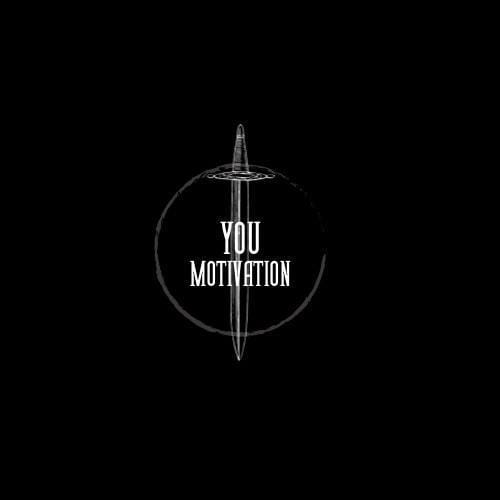
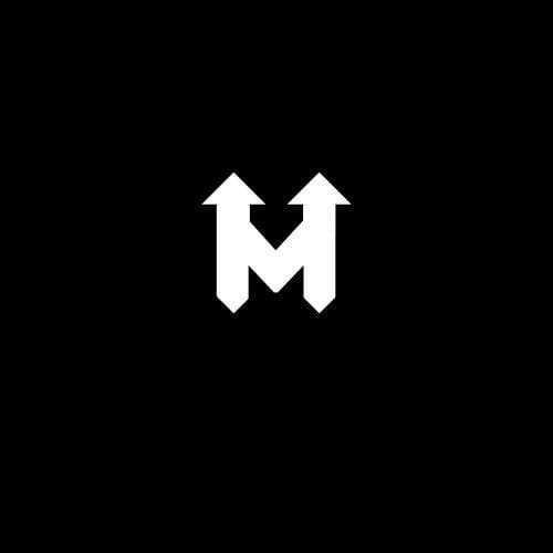
Here are my logos for one of my pages, just to show you a good logo vs bad logo…

New logo, currently using.
Too Dark & Low Contrast: On small profile icons, black-on-black with thin lines gets lost — it won’t “pop” in the feed.
Font Choice: The tall serif font looks dated and isn’t very readable at small sizes. Instagram logos need clarity, not fine detail.
Overcomplicated Symbol: The sword inside the circle adds visual noise. Logos for IG work best when ultra-simple and instantly recognizable.
No Unique Identity: The text “YOU MOTIVATION” is generic — it doesn’t separate the brand from 1000 other motivation pages.
verdict: It’s not scalable, not instantly memorable, and won’t stand out as a tiny profile picture, which is the #1 test for Instagram logos.

Old logo, discarded.
Simple & Bold: Clean “M” with arrows — instantly recognizable, even at small sizes.
High Contrast: White on black pops in the feed and profile icon.
Scalable: Looks sharp and clear from tiny circle to full screen.
Symbolic: Arrows upward give a motivational/forward-moving vibe — fits growth or inspiration niches.
Unique Identity: Minimal yet distinct — doesn’t feel like a generic template.
verdict: Strong, memorable, and Instagram-friendly.
This week, try this…
Audit your page:
Would you follow your own account if you saw it fresh?
Does your logo look DIY in the worst way?
Can someone spot your post in a crowded feed without your name?
If not — time to tighten the brand. Your look isn’t decoration. It’s the engine.